Using Shadcn UI with Docusaurus

Introduction
I love using Shadcn UI for my applications. The components are beautifully designed. Best of all, you can just copy and paste them into your apps. They are accessible, customizable, and fully open source.
I also love Docusaurus for building my documentation sites. It's a great way to create documentation sites quickly that look professional.
The only problem? They are really hard to use together. Because Docusaurus uses its own CSS framework (Infima) and a custom build system, it's hard to integrate Shadcn UI components into your Docusaurus site.
As an engineer, I couldn't let that stop me. I set out to find a way to integrate Shadcn UI components into my Docusaurus site and that is exactly what I'm going to show you in this guide.
Here were a couple of rules I set for myself:
- Tailwind CSS must be able to be used in conjunction with Docusaurus styling and build system
- Shadcn UI components should look and behave has they do on any other site
- The Shadcn CLI should be able to be used to generate components in the right directory
- No changes should be required to base components for them to work including path aliasing in Shadcn UI components
If you want to skip the line, you can just use the starter I open sourced on GitHub. Simply click the button below to clone the repo and get started. Contributions are always welcome!
Prerequisites
- Node.js v19+ (for Docusaurus 3.7.0)
- npm
- Git
- Basic React/TypeScript knowledge
- Familiarity with Tailwind
Initial Project Setup
We start by creating a new Docusaurus project within a Git repository.
- Create a new GitHub repository (leave it empty).
- Clone your repo:
git clone https://github.com/YOUR_USERNAME/YOUR_REPO_NAME.git
cd YOUR_REPO_NAME
- Install Docusaurus (version 3.7.0):
npx create-docusaurus@3.7.0 app classic --typescript
This will create a new folder in your repo called app that will contain the base Docusaurus site with no changes.
- Initialize & run:
cd app
npm install
npm run start
Visit http://localhost:3000 to see the default Docusaurus site.
Your project structure should look like this:
.
├── app/
    ├── blog/
    ├── docs/
    ├── src/
    │   ├── components/
    │   ├── css/
    │   └── pages/
    ├── static/
    ├── docusaurus.config.js
    ├── package.json
    ├── tsconfig.json
    └── .gitignore
Part 1: Setting Up Tailwind CSS
Installing Dependencies
We install specific versions of packages to ensure compatibility. The key dependencies are:
tailwindcssand its supporting packages for stylingclass-variance-authorityandclsxfor class name managementlucide-reactand@radix-ui/react-iconsfor icons used in Shadcn UI components
npm install -D tailwindcss@3.3.5 postcss@8.4.31 autoprefixer@10.4.16 \
  tailwindcss-animate class-variance-authority clsx tailwind-merge \
  lucide-react @radix-ui/react-icons recharts
Configuring Tailwind
Initialize Tailwind:
npx tailwindcss init
Update tailwind.config.js:
const { fontFamily } = require("tailwindcss/defaultTheme")

/** @type {import('tailwindcss').Config} */
module.exports = {
	darkMode: ['class', '[data-theme="dark"]'],
	content: [
		"./pages/**/*.{ts,tsx}",
		"./components/**/*.{ts,tsx}",
		"./app/**/*.{ts,tsx}",
		"./src/**/*.{ts,tsx}",
		"./docs/**/*.{js,jsx,ts,tsx,md,mdx}",
		"./blog/**/*.{js,jsx,ts,tsx,md,mdx}",
	],
	prefix: "",
	theme: {
		container: {
			center: true,
			padding: '2rem',
			screens: {
				'2xl': '1400px'
			}
		},
		extend: {
			fontFamily: {
				sans: [
					'Inter',
					...fontFamily.sans
				],
				jakarta: [
					'Plus Jakarta Sans',
					...fontFamily.sans
				],
				mono: [
					'Fira Code',
					...fontFamily.mono
				]
			},
			borderRadius: {
				lg: 'var(--radius)',
				md: 'calc(var(--radius) - 2px)',
				sm: 'calc(var(--radius) - 4px)'
			},
			colors: {
				border: 'hsl(var(--border))',
				input: 'hsl(var(--input))',
				ring: 'hsl(var(--ring))',
				background: 'hsl(var(--background))',
				foreground: 'hsl(var(--foreground))',
				primary: {
					DEFAULT: 'hsl(var(--primary))',
					foreground: 'hsl(var(--primary-foreground))'
				},
				secondary: {
					DEFAULT: 'hsl(var(--secondary))',
					foreground: 'hsl(var(--secondary-foreground))'
				},
				destructive: {
					DEFAULT: 'hsl(var(--destructive))',
					foreground: 'hsl(var(--destructive-foreground))'
				},
				muted: {
					DEFAULT: 'hsl(var(--muted))',
					foreground: 'hsl(var(--muted-foreground))'
				},
				accent: {
					DEFAULT: 'hsl(var(--accent))',
					foreground: 'hsl(var(--accent-foreground))'
				},
				popover: {
					DEFAULT: 'hsl(var(--popover))',
					foreground: 'hsl(var(--popover-foreground))'
				},
				card: {
					DEFAULT: 'hsl(var(--card))',
					foreground: 'hsl(var(--card-foreground))'
				},
				sidebar: {
					DEFAULT: 'hsl(var(--sidebar-background))',
					foreground: 'hsl(var(--sidebar-foreground))',
					primary: 'hsl(var(--sidebar-primary))',
					'primary-foreground': 'hsl(var(--sidebar-primary-foreground))',
					accent: 'hsl(var(--sidebar-accent))',
					'accent-foreground': 'hsl(var(--sidebar-accent-foreground))',
					border: 'hsl(var(--sidebar-border))',
					ring: 'hsl(var(--sidebar-ring))'
				}
			},
			keyframes: {
				'accordion-down': {
					from: {
						height: '0'
					},
					to: {
						height: 'var(--radix-accordion-content-height)'
					}
				},
				'accordion-up': {
					from: {
						height: 'var(--radix-accordion-content-height)'
					},
					to: {
						height: '0'
					}
				}
			},
			animation: {
				'accordion-down': 'accordion-down 0.2s ease-out',
				'accordion-up': 'accordion-up 0.2s ease-out'
			},
			borderColor: {
				DEFAULT: 'hsl(var(--border))'
			}
		}
	},
	plugins: [require("tailwindcss-animate")],
};
Creating Custom Plugins
The plugin system is crucial for this integration. We create two plugins:
- A Tailwind plugin that configures PostCSS to process Tailwind directives within Docusaurus's build system
- An alias plugin that enables Shadcn UI's expected import paths to work correctly
First, create a plugins directory inside your app folder:
mkdir plugins
Create the Tailwind plugin at app/plugins/tailwind-config.cjs:
function tailwindPlugin(context, options) {
  return {
    name: 'tailwind-plugin',
    configurePostCss(postcssOptions) {
      postcssOptions.plugins = [
        require('postcss-import'),
        require('tailwindcss'),
        require('autoprefixer'),
      ];
      return postcssOptions;
    },
  };
}

module.exports = tailwindPlugin;
Create the alias plugin at app/plugins/alias-config.cjs:
const path = require('path');

function aliasPlugin(context, options) {
  return {
    name: 'docusaurus-plugin-aliases',
    configureWebpack() {
      return {
        resolve: {
          alias: {
            '@': path.resolve(__dirname, '../src'),
          },
        },
      };
    },
  };
}

module.exports = aliasPlugin;
Updating Docusaurus Configuration
The configuration ties everything together by:
- Registering our custom plugins
- Setting up path aliases
- Ensuring Tailwind processes the right files
Update app/docusaurus.config.js:
import tailwindPlugin from "./plugins/tailwind-config.cjs";
import aliasPlugin from "./plugins/alias-config.cjs";

const config = {
  // ...
  // Plugins
  plugins: [
    tailwindPlugin,
    aliasPlugin,
  ],
};

export default config;
Adding Global CSS
This CSS configuration is critical because it:
- Preserves Docusaurus's theme system through Infima variables
- Adds Shadcn UI's design tokens
- Ensures proper dark mode support
- Sets up base styles that work with both systems
In src/css/custom.css, include Tailwind and keep Infima variables intact:
/**
 * Any CSS included here will be global. The classic template
 * bundles Infima by default. Infima is a CSS framework designed to
 * work well for content-centric websites.
 */

/* Import the fonts */
@import url('https://fonts.googleapis.com/css2?family=Inter:wght@100..900&display=swap');
@import url('https://fonts.googleapis.com/css2?family=Plus+Jakarta+Sans:wght@200..800&display=swap');
@import url('https://fonts.googleapis.com/css2?family=Fira+Code:wght@300..700&display=swap');

/* You can override the default Infima variables here. */
:root {
  /* Preserve Docusaurus variables */
  --ifm-color-primary: #2e8555;
  --ifm-color-primary-dark: #29784c;
  --ifm-color-primary-darker: #277148;
  --ifm-color-primary-darkest: #205d3b;
  --ifm-color-primary-light: #33925d;
  --ifm-color-primary-lighter: #359962;
  --ifm-color-primary-lightest: #3cad6e;
  --ifm-code-font-size: 95%;
  --docusaurus-highlighted-code-line-bg: rgba(0, 0, 0, 0.1);

  /* shadcn variables - updated */
  --background: 0 0% 100%;
  --foreground: 240 10% 3.9%;
  --card: 0 0% 100%;
  --card-foreground: 240 10% 3.9%;
  --popover: 0 0% 100%;
  --popover-foreground: 240 10% 3.9%;
  --primary: 240 5.9% 10%;
  --primary-foreground: 0 0% 98%;
  --secondary: 240 4.8% 95.9%;
  --secondary-foreground: 240 5.9% 10%;
  --muted: 240 4.8% 95.9%;
  --muted-foreground: 240 3.8% 46.1%;
  --accent: 240 4.8% 95.9%;
  --accent-foreground: 240 5.9% 10%;
  --destructive: 0 84.2% 60.2%;
  --destructive-foreground: 0 0% 98%;
  --border: 240 5.9% 90%;
  --input: 240 5.9% 90%;
  --ring: 240 5.9% 10%;
  --radius: 0.5rem;

  /* New variables for background colors */
  background-color: hsl(var(--background));
  color: hsl(var(--foreground));
}

/* For readability concerns, you should choose a lighter palette in dark mode. */
[data-theme='dark'] {
  /* Preserve Docusaurus dark mode variables */
  --ifm-color-primary: #25c2a0;
  --ifm-color-primary-dark: #21af90;
  --ifm-color-primary-darker: #1fa588;
  --ifm-color-primary-darkest: #1a8870;
  --ifm-color-primary-light: #29d5b0;
  --ifm-color-primary-lighter: #32d8b4;
  --ifm-color-primary-lightest: #4fddbf;
  --docusaurus-highlighted-code-line-bg: rgba(0, 0, 0, 0.3);

  /* shadcn dark mode variables - updated */
  --background: 240 10% 3.9%;
  --foreground: 0 0% 98%;
  --card: 240 10% 3.9%;
  --card-foreground: 0 0% 98%;
  --popover: 240 10% 3.9%;
  --popover-foreground: 0 0% 98%;
  --primary: 0 0% 98%;
  --primary-foreground: 240 5.9% 10%;
  --secondary: 240 3.7% 15.9%;
  --secondary-foreground: 0 0% 98%;
  --muted: 240 3.7% 15.9%;
  --muted-foreground: 240 5% 64.9%;
  --accent: 240 3.7% 15.9%;
  --accent-foreground: 0 0% 98%;
  --destructive: 0 62.8% 30.6%;
  --destructive-foreground: 0 0% 98%;
  --border: 240 3.7% 15.9%;
  --input: 240 3.7% 15.9%;
  --ring: 240 4.9% 83.9%;
}

@tailwind base;
@tailwind components;
@tailwind utilities;

/* Ensure the entire document has the background color */
html,
body {
  background-color: hsl(var(--background));
  color: hsl(var(--foreground));
}

/* Restore Docusaurus markdown styles */
.markdown h1 {
  color: var(--ifm-heading-color);
  font-family: var(--ifm-heading-font-family);
  font-weight: var(--ifm-heading-font-weight);
  line-height: var(--ifm-heading-line-height);
  margin: var(--ifm-heading-margin-top) 0 var(--ifm-heading-margin-bottom) 0;
  font-size: var(--ifm-h1-font-size);
}

.markdown h2 {
  color: var(--ifm-heading-color);
  font-family: var(--ifm-heading-font-family);
  font-weight: var(--ifm-heading-font-weight);
  line-height: var(--ifm-heading-line-height);
  margin: var(--ifm-heading-margin-top) 0 var(--ifm-heading-margin-bottom) 0;
  font-size: var(--ifm-h2-font-size);
}

.markdown h3 {
  color: var(--ifm-heading-color);
  font-family: var(--ifm-heading-font-family);
  font-weight: var(--ifm-heading-font-weight);
  line-height: var(--ifm-heading-line-height);
  margin: var(--ifm-heading-margin-top) 0 var(--ifm-heading-margin-bottom) 0;
  font-size: var(--ifm-h3-font-size);
}

.markdown h4 {
  color: var(--ifm-heading-color);
  font-family: var(--ifm-heading-font-family);
  font-weight: var(--ifm-heading-font-weight);
  line-height: var(--ifm-heading-line-height);
  margin: var(--ifm-heading-margin-top) 0 var(--ifm-heading-margin-bottom) 0;
  font-size: var(--ifm-h4-font-size);
}

.markdown ul,
.markdown ol {
  margin: 0 0 var(--ifm-list-margin);
  padding-left: var(--ifm-list-left-padding);
}

.markdown ul {
  list-style: disc;
}

.markdown ul ul {
  list-style: circle;
}

.markdown ul ul ul {
  list-style: square;
}

.markdown ol {
  list-style: decimal;
}

.markdown li {
  margin: var(--ifm-list-item-margin);
}

.markdown p {
  margin: var(--ifm-paragraph-margin-bottom) 0;
}

.markdown a {
  color: var(--ifm-link-color);
  text-decoration: var(--ifm-link-decoration);
}

.markdown a:hover {
  color: var(--ifm-link-hover-color);
  text-decoration: var(--ifm-link-hover-decoration);
}

/* Apply shadcn base styles */
.border-border {
  @apply border-[hsl(var(--border))];
}

/* Ensure shadcn components use the correct font */
:not(.markdown) {
  font-family: theme('fontFamily.sans');
}

/* Apply shadcn styles to Docusaurus components */
.navbar {
  background-color: hsl(var(--background));
  border-bottom: 1px solid hsl(var(--border));
}

.navbar__brand,
.navbar__link,
.navbar__toggle,
.navbar-sidebar__brand {
  color: hsl(var(--foreground));
  display: inline-flex;
  align-items: center;
  gap: 0.25rem;
}

.navbar__toggle:hover,
.navbar__link:hover {
  color: var(--ifm-color-primary);
  background-color: transparent;
}

/* Style cards and other content containers */
.card {
  background-color: hsl(var(--card));
  border: 1px solid hsl(var(--border));
  border-radius: var(--radius);
  color: hsl(var(--card-foreground));
}

/* Style the theme toggle */
.navbar__items--right>div[class*='toggle'] {
  background-color: transparent;
  color: hsl(var(--muted-foreground));
}

/* Style the search bar */
.navbar__search-input {
  background-color: hsl(var(--input));
  color: hsl(var(--foreground));
  border-color: hsl(var(--border));
}

/* Style the dropdown menus */
.dropdown__menu {
  background-color: hsl(var(--popover));
  color: hsl(var(--popover-foreground));
  border: 1px solid hsl(var(--border));
  border-radius: var(--radius);
}

.dropdown__link {
  color: hsl(var(--foreground));
}

.dropdown__link:hover {
  background-color: hsl(var(--accent));
  color: hsl(var(--accent-foreground));
}

/* Add focus styles for inputs */
.navbar__search-input:focus,
input:focus {
  outline: none;
  border-color: hsl(var(--ring));
  box-shadow: 0 0 0 2px hsl(var(--ring) / 0.3);
}

/* Style the footer */
.footer {
  background-color: hsl(var(--muted));
  color: hsl(var(--muted-foreground));
  border-top: 1px solid hsl(var(--border));
}

.footer--dark {
  background-color: hsl(var(--background));
  color: hsl(var(--foreground));
}

.footer__title {
  color: hsl(var(--foreground));
}

.footer__link-item {
  display: inline-flex;
  align-items: center;
  gap: 0.25rem;
  color: hsl(var(--muted-foreground));
}

.footer__link-item:hover {
  color: var(--ifm-color-primary);
  background-color: transparent;
  text-decoration: none;
}

.footer__copyright {
  color: hsl(var(--muted-foreground));
}

/* Fix breadcrumb alignment */
.breadcrumbs {
  display: flex;
  align-items: center;
}

.breadcrumbs__item {
  display: inline-flex;
  align-items: center;
}

.breadcrumbs__link {
  display: inline-flex;
  align-items: center;
}

.breadcrumbHomeIcon_YNFT {
  margin-top: 1px;
  vertical-align: middle;
}
You can now test adding Tailwind classes to your components. For example, adding a green background to the HomepageHeader component:
function HomepageHeader() {
  const { siteConfig } = useDocusaurusContext();
  return (
    <header className={clsx('hero hero--primary', styles.heroBanner)}>
      <div className="container">
        <Heading as="h1" className="hero__title">
          {siteConfig.title}
        </Heading>
        <p className="hero__subtitle">{siteConfig.tagline}</p>
        <div className={styles.buttons}>
          <Link
            className="button button--secondary button--lg bg-green-500"
            to="/docs/intro">
            Docusaurus Tutorial - 5min ⏱️
          </Link>
        </div>
      </div>
    </header>
  );
}
You can now use Tailwind with your Docusaurus app!
Part 2: Integrating Shadcn UI Components
Setting Up the Utility Function
The utility function is essential for Shadcn UI as it provides the cn helper that merges Tailwind classes efficiently. This is a core part of how Shadcn UI handles dynamic styling.
First, create the lib directory in your Docusaurus project within the app folder:
mkdir -p src/lib
Create the utilities file at app/src/lib/utils.ts:
import { type ClassValue, clsx } from "clsx"
import { twMerge } from "tailwind-merge"

export function cn(...inputs: ClassValue[]) {
  return twMerge(clsx(inputs))
}
This file is used by Shadcn UI to merge Tailwind classeså.
Configuring TypeScript
TypeScript configuration is important for:
- Enabling proper import aliases
- Ensuring type safety across both systems
- Maintaining compatibility with Docusaurus's TypeScript setup
Update app/tsconfig.json:
{
  "extends": "@docusaurus/tsconfig",
  "compilerOptions": {
    "baseUrl": ".",
    "paths": {
      "@site/*": [
        "./*"
      ], // Docusaurus's path alias
      "@/*": [
        "./src/*"
      ] // Shadcn UI's expected path alias
    }
  }
}
Setting Up Shadcn UI Configuration
The components.json configuration tells Shadcn UI:
- Where to find and place components
- How to handle styling
- Which import aliases to use
- What icon library to use by default
Create the Shadcn UI configuration file at app/components.json:
{
  "$schema": "https://ui.shadcn.com/schema.json",
  "style": "new-york",
  "rsc": false,
  "tsx": true,
  "tailwind": {
    "config": "tailwind.config.js",
    "css": "src/index.css",
    "baseColor": "zinc",
    "cssVariables": true,
    "prefix": ""
  },
  "aliases": {
    "components": "@/components",
    "utils": "@/lib/utils",
    "ui": "@/components/ui",
    "lib": "@/lib",
    "hooks": "@/hooks"
  },
  "iconLibrary": "lucide"
}
Installing Components
Now you can install Shadcn UI components. Make sure you're in the Docusaurus project directory:
cd app  # if you're not already in the app directory
npx shadcn@latest add button card input label
This will create the components in app/src/components/ui/. Your project structure should now include:
YOUR_REPO_NAME/          # Your repository root
└── app/                # Docusaurus project directory
    ├── src/
    │   ├── components/
    │   │   └── ui/    # Shadcn UI components
    │   │       ├── button.tsx
    │   │       ├── card.tsx
    │   │       ├── input.tsx
    │   │       └── label.tsx
    │   ├── lib/
    │   │   └── utils.ts
    │   ├── css/
    │   └── pages/
    ├── docs/
    │   └── shadcn-ui-examples/
    │       └── card.mdx
    ├── components.json # Shadcn UI config
    ├── docusaurus.config.js
    ├── tailwind.config.js
    └── ... other files
This is great because it means you can simply use the CLI for installation rather than manually adding the components from the Shadcn UI website.
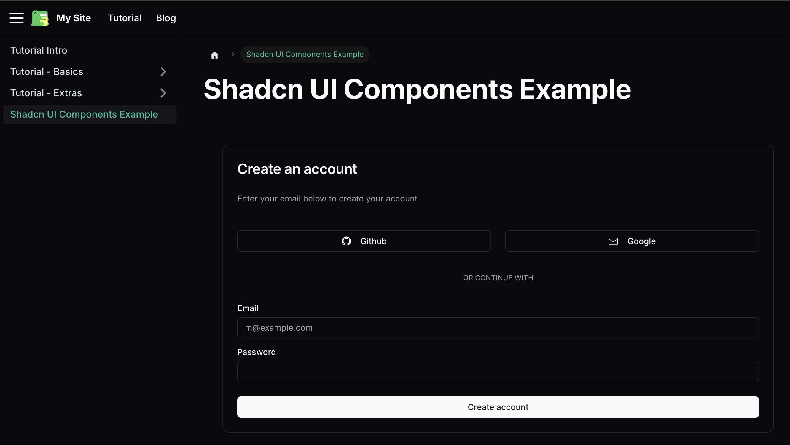
Testing the Integration
The test page demonstrates:
- Proper component importing
- Correct styling application
- Dark mode support
- Integration with Docusaurus's MDX system
Create a new documentation page at app/docs/components.md:
# Shadcn UI Components Example

import { Button } from "@/components/ui/button"
import {
  Card,
  CardContent,
  CardDescription,
  CardFooter,
  CardHeader,
  CardTitle,
} from "@/components/ui/card"
import { Input } from "@/components/ui/input"
import { Label } from "@/components/ui/label"
import { GitHubLogoIcon, EnvelopeClosedIcon } from "@radix-ui/react-icons"

<div className="container mx-auto py-10">
  <Card>
    <CardHeader className="space-y-1">
      <CardTitle className="text-2xl">Create an account</CardTitle>
      <CardDescription>
        Enter your email below to create your account
      </CardDescription>
    </CardHeader>
    <CardContent className="grid gap-4">
      <div className="grid grid-cols-2 gap-6">
        <Button variant="outline">
          <GitHubLogoIcon className="mr-2 h-4 w-4" />
          Github
        </Button>
        <Button variant="outline">
          <EnvelopeClosedIcon className="mr-2 h-4 w-4" />
          Google
        </Button>
      </div>
      <div className="relative">
        <div className="absolute inset-0 flex items-center">
          <span className="w-full border-t" />
        </div>
        <div className="relative flex justify-center text-xs uppercase">
          <span className="bg-background px-2 text-muted-foreground">
            Or continue with
          </span>
        </div>
      </div>
      <div className="grid gap-2">
        <Label htmlFor="email">Email</Label>
        <Input id="email" type="email" placeholder="m@example.com" />
      </div>
      <div className="grid gap-2">
        <Label htmlFor="password">Password</Label>
        <Input id="password" type="password" />
      </div>
    </CardContent>
    <CardFooter>
      <Button className="w-full">Create account</Button>
    </CardFooter>
  </Card>
</div>
Run npm run start and navigate to docs/components. You should now see the Shadcn UI components integrated into your Docusaurus site!
Conclusion
You have successfully integrated Shadcn UI into a Docusaurus site by:
- Preserving Docusaurus's Infima styles
- Configuring Tailwind via a custom plugin
- Mapping path aliases for Shadcn UI
- Maintaining TypeScript compatibility
For more, check the official Docusaurus docs and Shadcn UI docs. Also see the docusaurus-shadcnui-starter for a working example.